
Creating fresh email designs can become difficult when you’re working on campaigns regularly. After a while, familiar layouts start appearing in every newsletter, product announcement, and promotional message. Even small changes can feel repetitive when you’re using the same design approach.
Looking at examples from different brands can help you understand how email layouts have evolved and how companies present information to their subscribers. Some websites collect real marketing emails, while others feature design concepts, templates, and practical resources.
The following ten websites offer different perspectives on email design, from visual presentation to content organization and technical considerations.
1. Milled
Milled maintains an archive of marketing emails from retail and ecommerce brands. Its collection includes seasonal promotions, product announcements, newsletters, and other customer communications.
Browsing emails from the same company over several months can reveal how its design approach changes depending on the campaign. A holiday promotion might feature larger images and more prominent discounts, while a regular newsletter may use a simpler structure.
These comparisons also show how brands maintain recognizable visual elements while adapting their messaging to different occasions.
2. Really Good Emails
Really Good Emails collects email campaigns from companies across different industries. The examples cover welcome messages, newsletters, product updates, and promotional communications.
Looking at HTML email templates can provide a starting point for understanding how different layouts arrange headlines, images, text, and calls to action.
For example, a welcome email may introduce the company with a short message and a single button, while a product newsletter might include several content sections.
It’s worth comparing how these structures influence readability, particularly on smaller screens. The amount of text, spacing between elements, and placement of buttons can all affect how easily readers understand the message.
3. MailCharts
MailCharts focuses largely on ecommerce email marketing, with examples covering different stages of customer communication.
Its collection includes abandoned cart reminders, welcome sequences, product promotions, and other automated campaigns.
Examining several emails from one customer journey can reveal how their content and design change over time. An initial welcome message may provide general information, while later emails focus on specific products or customer actions.
This broader perspective helps explain why different campaign types often require different layouts.
4. Good Email Copy
Good Email Copy concentrates on the written content of emails rather than elaborate visual design.
The collection includes examples of onboarding messages, account notifications, customer updates, and other common communications.
Many examples rely on short paragraphs, straightforward explanations, and limited visual elements. This makes it easier to examine how writing and layout work together.
A message explaining an account change, for instance, usually benefits from a clear explanation more than decorative graphics. The examples illustrate how content requirements can influence design decisions.
5. Behance
Behance features creative projects submitted by designers, including email newsletters and marketing campaign concepts.
Searching for email-related projects reveals different approaches to typography, imagery, spacing, and brand presentation.
Some projects show complete campaign designs, while others present individual screens or visual concepts.
One important consideration is that portfolio designs aren’t always developed with email client limitations in mind. Complex layouts, unusual fonts, and overlapping elements may need adjustments before being used in an actual email.
6. Dribbble
Dribbble provides another collection of design work, often emphasizing individual visual concepts and interface elements.
Email-related projects may include newsletter headers, product cards, promotional sections, and button designs.
These examples can be useful for examining how designers arrange smaller components within a layout.
For instance, comparing different product card designs can show how image size, text placement, and spacing influence the appearance of a promotional section.
As with other portfolio platforms, the designs should be considered visual references rather than finished, tested email campaigns.
7. Pinterest
Pinterest contains visual references covering many aspects of email design, including newsletter layouts, promotional banners, and typography.
Search results often combine examples from marketing campaigns with independent design projects.
Organizing references into separate boards can make it easier to compare layouts for different purposes, such as product announcements or editorial newsletters.
However, images shared on Pinterest don’t always include information about the original campaign. Without that context, it’s difficult to determine whether a particular design performed well or was ever used in an actual email.
8. Stripo
Stripo provides email templates and editing tools for creating different types of messages.
Its template collection includes newsletters, invitations, promotional emails, and transactional communications.
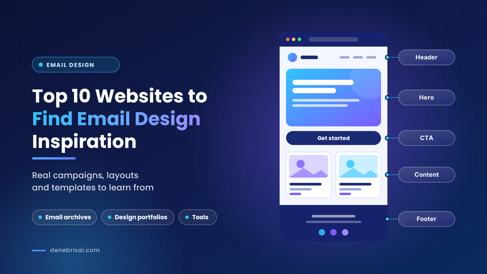
Examining these layouts can show how common email components are structured, including headers, content blocks, images, and footer sections.
Templates also illustrate how reusable design elements can create consistency across campaigns.
However, the structure still needs to match the content. A layout designed for a product promotion may not work equally well for a detailed company newsletter.
9. Canva
Canva includes design resources that can be used to create visual elements for email campaigns.
These may include promotional banners, branded graphics, and images for newsletters.
Its layouts provide examples of how typography, color, and imagery can be combined to present information visually.
However, there’s a difference between designing a graphic and building a functional email. A complete email still needs appropriate HTML structure and responsive behavior.
Important information should also remain accessible when images are blocked or fail to load, which is why text and buttons generally shouldn’t be embedded entirely within graphics.
10. Litmus
Litmus publishes resources covering email design, development, testing, and accessibility.
These materials address practical considerations that aren’t always visible in design galleries.
For example, different email clients may interpret fonts, spacing, and background images differently. Dark mode can also affect how certain colors and visual elements appear.
Understanding these differences is important when evaluating a design’s suitability for actual campaigns.
A layout that appears consistent in a design file may require adjustments before it displays properly across different inboxes and devices.
How to Turn Email Design Inspiration Into Better Campaigns
Finding attractive email designs is relatively easy. The bigger challenge is deciding which ideas are worth using and how they might fit your own campaigns. A layout that works well for a fashion retailer, for example, may not suit a software company’s monthly newsletter.
Rather than collecting examples based only on appearance, start by identifying what you’re trying to improve. Perhaps your newsletters feel too crowded, promotional emails lack a clear visual hierarchy, or important information gets overlooked because several elements compete for attention.
Once you know what needs improvement, look for examples that address similar challenges.
If your emails contain several articles or announcements, examine how other brands separate content sections without making the message feel disconnected. Notice whether they use headings, background colors, spacing, or simple dividers to guide readers through the information.
The same approach works for promotional campaigns. Compare how different emails introduce an offer, explain its value, and direct attention toward the next step. Sometimes a shorter message with one clear action feels more organized than a visually elaborate design containing several competing elements.
It’s also useful to collect examples by purpose rather than keeping everything in one folder. Separating newsletters, welcome emails, promotional messages, and transactional communications makes it easier to find relevant references when planning a new campaign.
Before adapting a design, consider how it will work with your actual content. A layout may look balanced when it contains two short paragraphs, but become difficult to read when your message requires more explanation. Likewise, a design built around large photography may not be appropriate if your audience primarily expects written updates.
You don’t need to adopt every interesting idea you find. Testing one change at a time, such as adjusting content spacing, simplifying the header, or changing the placement of a button, can make it easier to understand what improves the reading experience.
Another useful habit is revisiting your saved examples regularly. Email design preferences change, and layouts that once felt effective may no longer suit your audience. Reviewing older references alongside newer campaigns can help you recognize emerging patterns while avoiding unnecessary redesigns that add complexity without improving the overall experience for subscribers.
Getting feedback from colleagues can also help you evaluate design choices more objectively. Someone unfamiliar with the campaign may notice confusing sections, unclear messaging, or visual elements that distract from the main purpose. A quick review before finalizing the layout can prevent unnecessary revisions and improve the overall reading experience.
Over time, the examples you collect can become a practical reference library. Instead of starting every campaign with a blank page, you’ll have a clearer sense of which design approaches fit different messages and which ones are better left as visual inspiration.
Conclusion
Email design inspiration comes from more than attractive layouts. Studying how different emails organize information, communicate messages, and respond to technical limitations provides a broader understanding of what makes a design practical.
Each of these websites approaches email design from a different perspective, and the examples are most useful when considered in the context of their intended purpose.
Rather than reproducing an existing design, focus on understanding the decisions behind it. That approach can help you create emails that serve your content and audience more effectively.
FAQs
1. Where can I find inspiration for designing an email newsletter?
Milled, Really Good Emails and MailCharts show real marketing emails, while Behance, Dribbble and Pinterest offer visual concepts. Save examples in separate folders by purpose, such as newsletters or promotions.
2. What are some good email design platforms?
Stripo offers email templates and editing tools, and Canva helps create banners and graphics. Litmus is useful for testing how emails look across different email clients.
3. What are the best websites to find email design inspiration?
Milled, Really Good Emails, MailCharts and Good Email Copy are best for real campaign examples. Behance, Dribbble, Pinterest, Stripo, Canva and Litmus cover design concepts, templates and technical resources.
4. How do I choose which email design ideas to use?
Start by identifying what you want to improve, then look for examples that solve that problem. Test one change at a time, such as spacing, header or button placement.
5. Can I copy designs from Behance, Dribbble, or Pinterest directly into my emails?
No, because these designs often ignore email client limits, so complex layouts and unusual fonts need adjusting. Treat them as visual references and don’t put text or buttons only inside images.

Comments are closed